Our Guest Room: The Reveal!
Eeeek! It’s here! It’s finally here! I am so exited to share one of my favorite projects to date. We really wanted to give our guest room a face lift, especially since we are finding ourselves having so many friends and family visit- haha! What better excuse then that to make something beautiful. We have partnered with so many fabulous brands on this one, and we cant wait to show you what we did it! Special thanks to Alison Elefante from Ruby Peach Photo for all of the fabulous photos of this pretty space! We adore them so much. Without further ado, drumroll please…BAM!
Lighting sources: Table Lamp/ Picture Light / chandelier / Floor Lamp
To start, here are some before photos. YIKESSSS! Newlywed life with stacks of invitations, wedding gifts, trash, and a lot of junk. The room was so flat, and had zero architectural elements to feed of of. It had nothing special and did not make my guest feel cozy and welcome, thats for sure! I wanted to fix those two things with whatever we did. Add interesting element, and make it feel more comfy!
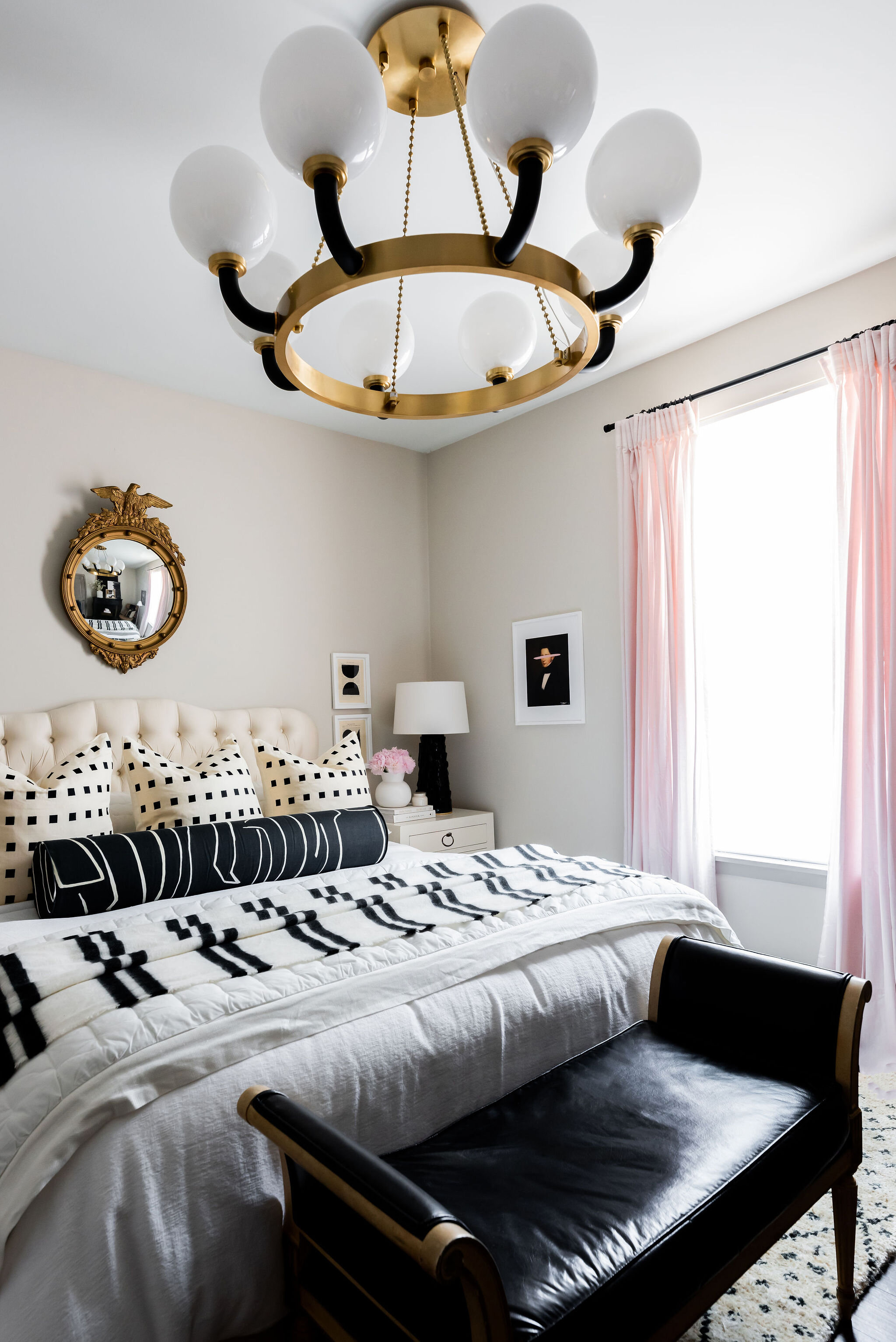
It will be a constant life struggle with my husband (and most husbands around the world) that a fan should or shouldn’t be in the room. Yes, I agree it gets hot at night and I can appreciate some air flow, but just like beauty is pain - aesthetic is hot and stuffy. Ha! Our compromise was that the fan could be replaced in the guest room, but not the master. (He won this one for sure!) I guess the saying “choose your battles” is real when you say “I Do!”. #stilllearning. I am so thrilled to replace that baby with the gorgeous Werner chandelier from Hudson Valley Lighting Group in Aged Brass. We chose the 48’’ diameter one, because it was around the same ballpark diameter as the wingspan of the fan. I would rather a little bit larger of lighting overhead, then small. In this space especially, I wanted the chandelier to be the focal point- and I think that was success! Like— HOW PRETTY!?
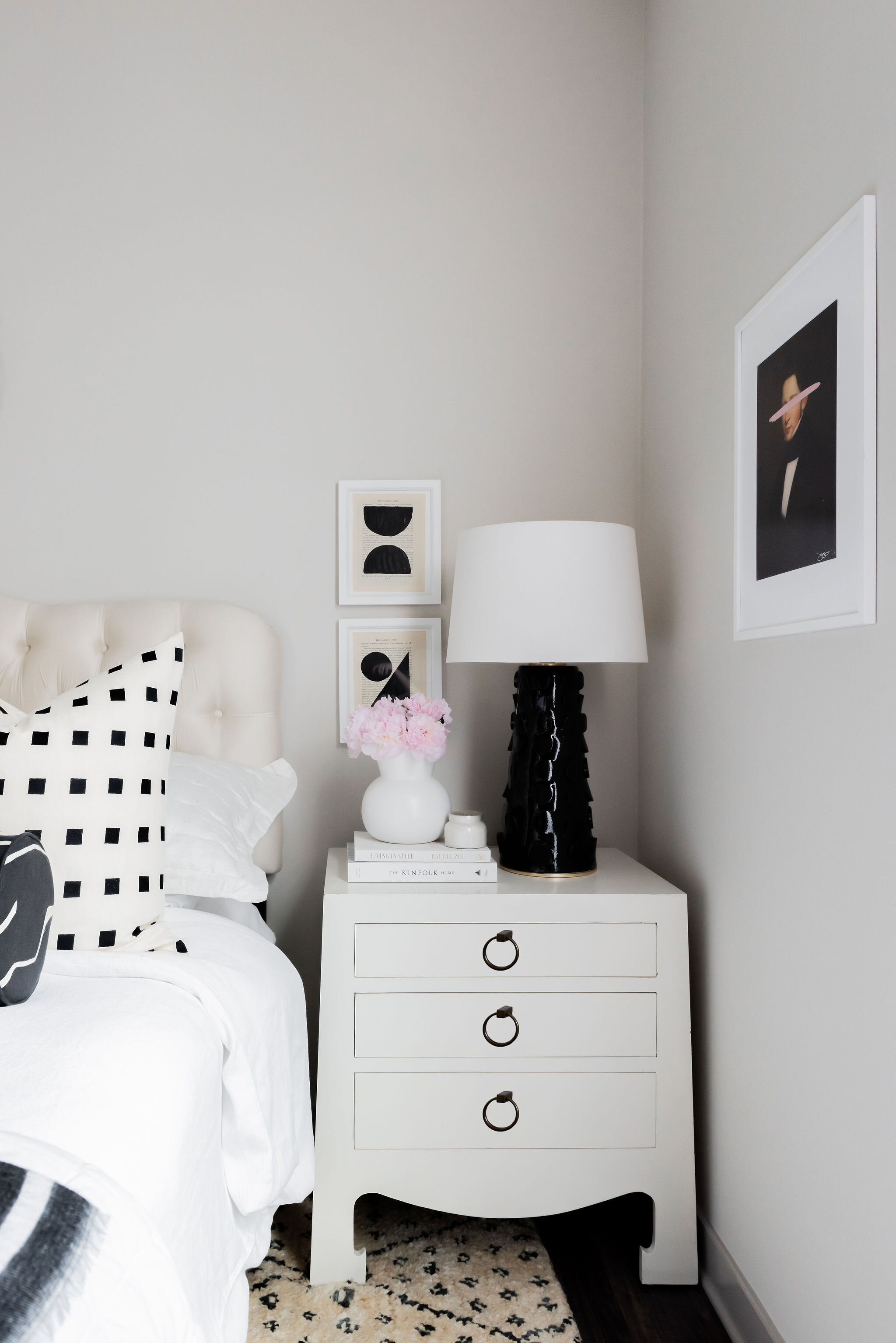
OK, so now that we got the hideous before pictures out of the way, its time to jump into the design phase. Like I do all of my own client projects, we start with concepts and then build out the renderings. I knew I wanted to keep with the black and white theme from the rest of the house, but add a little bit of color. I already had this Portrait Piece by Josh Young Design House that had a blush slash through the eyes, so I knew I wanted that to be my accent color. Plus- I knew that if I did pink in here as an accent, that the blacks and white would really pop!
I have had my heart set on the Doti Rug by Annie Selke ever since I saw it in Amber Fillerup’s living room! I believe that every space should start with one of 3 things, either a rug, artwork, or a fabric print that you really have your heart set on! The rug was definitely the starting point for the patterns in this space and was the backbone to the design. Thank you Annie Selke for sponsoring this baby for us- without it this space wouldn’t be nearly as swoon worthy!
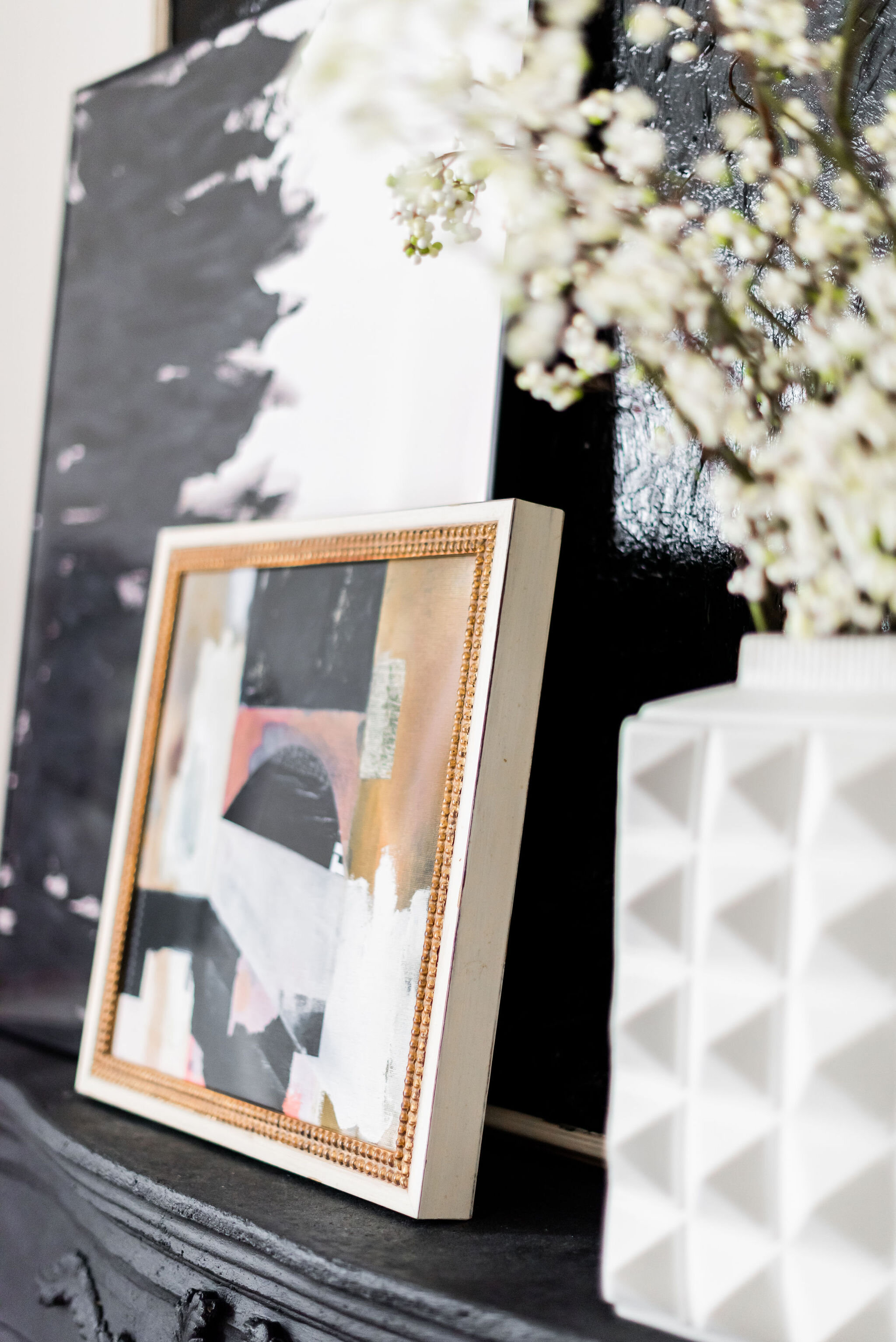
I am a bit of a hoarder of artwork, I don’t think thats a secret. I knew I kind of wanted an overload of art for this space, so I called up my friends at Artfully Walls and pulled together a collection of some of my favorite pieces for in here. I have loved the Knuba print for years, and knew I wanted to somehow build off that color scheme and quirky vibe. The Lowdown tied in all of the colors in this space to perfectly, and layered on the mantle so well. I love it all!
artwork sources: Knuba Print / The Lowdown Print / White Peacock / Divide
Sources:
Vase / Chair- thrifted / Artwork: Knuba Print / The Lowdown Print / White Peacock / Divide Mantle- thrifted / Bench- thrifted / Floor lamp
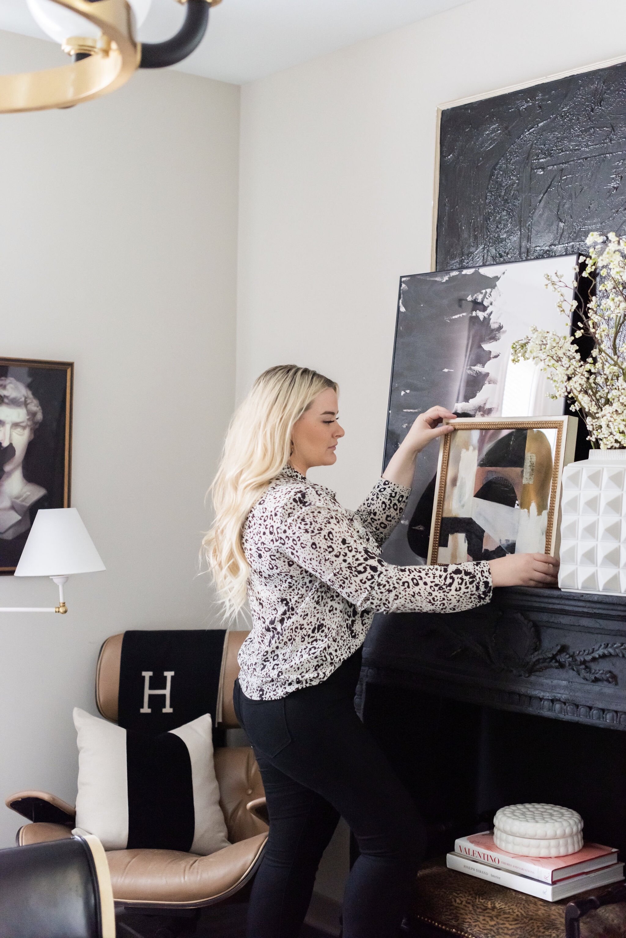
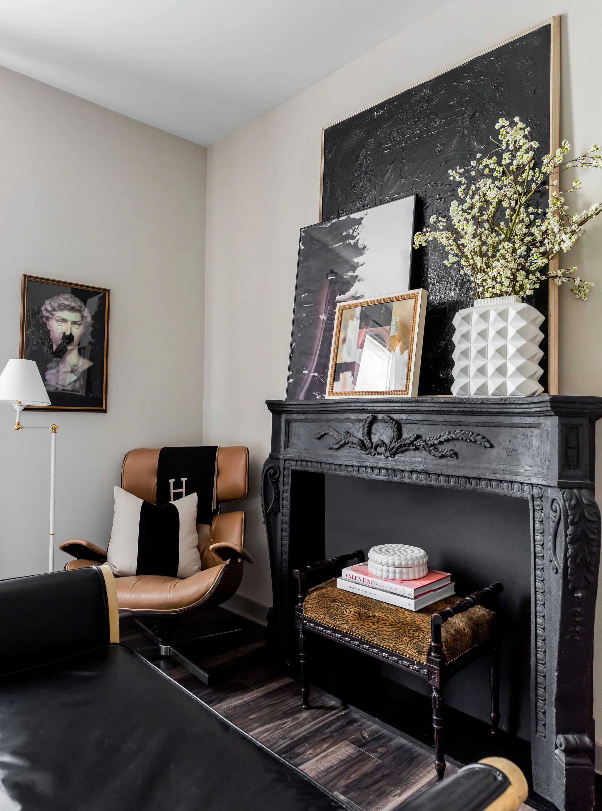
So good, right? I love the stacked artwork on the mantle. I picked up this antique mantle about 6 months ago or so for $150, and knew I wanted it to live in the guest room with stacked artwork on top of it. I wanted that spot to shine, and have its own moment. And can we just talk about this Jonathan Adler Vase that we got as a wedding gift? Hello, gorgeous. It’s massive and stands as such a statement in all its glory. I may or may not move it around my house to my liking throughout the week because its THAT good. Swoon.
Bedding sources:
Duvet/ Cover /Ivory Quilt /Flat Sheet /Fitted Sheet /Bolster Pillow Cover/ Black and White Pillow Cover /Velvet Pillow Cover
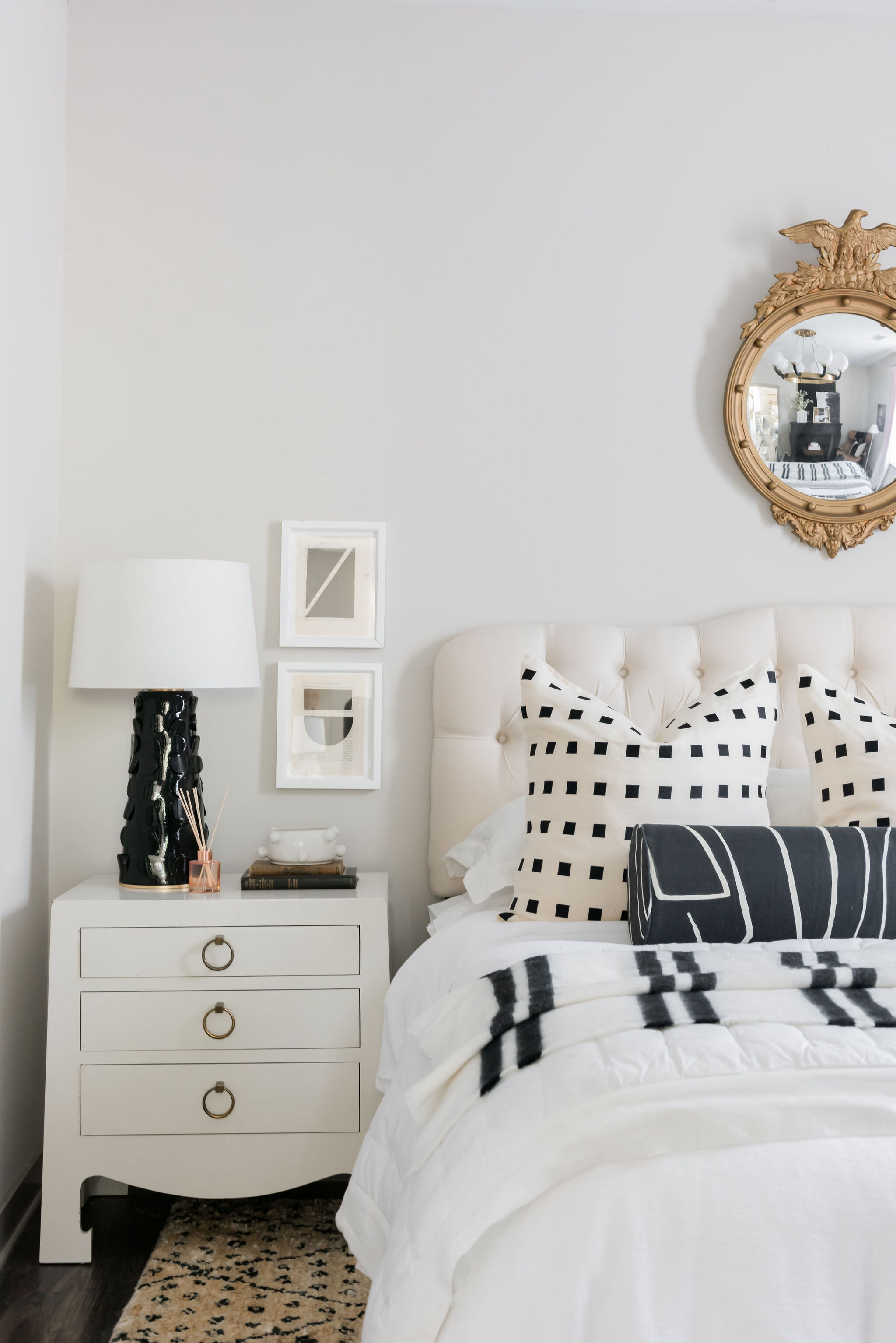
Ok, next little bit of business I need to address because OH MY GOSH. The bedding. The pillows. The detail. The comfort. Thank. you to Annie Selke’s Pine Cone Hill for all of the pretty white bedding for this space. Our guests will sleep easy and will never want to leave! It may be a little “tooooo” comfy, if you know what I mean. Maybe that’s a bad thing. LOL! And thank you Evia Mae and Alex for our gorgeous Chalet pillow covers and Little Design Company for the black Graffito Bolster! They all tie everything in and play such a part in the bed!
This shot below is one of my favorites. I love seeing how everything plays off each other, but also has their own shining moment themselves. I love playing with scale, and having larger pieces married to smaller pieces. The faux fireplace, the bench, and this CHAIR! This chair was such a freaking steal at $100 off someone in small town Tennessee off Facebook Marketplace! It may be a bit wobbly, but she sure is pretty! I need to get it fixed asap, but for now she sits pretty in the corner of this space and I couldn’t be happier with it. Now, need to keep an eye out for the matching ottoman!
Lighting Source: Naomi Lamp / Floor lamp
Have you ever seen more gorgeous lamp ever in your entire life? I haven’t! The Naomi Table Lamp in Black by Hudson Valley Lighting is SO beautiful. The scale is just unreal, and the detail in the base of the lamp is so intricate and pretty, but also bold and makes a statement! It comes in white, too- which I love so much. Thank you Hudson Valley for the prettiest lamps (and lighting in general) in all the land!
Well, thats a wrap! What do ya’ll think? I am just so so happy with the way that it turned out. It’s so glam, but also has that traditional eclectic twist that I always like to spin into my designs. Black and white will never go out of style, and the pink- well… it’s my 3rd favorite color and that is here to stay for a bit, too! I hope you loved this one, cause we sure do! (Rhyming unintended- Lol!)


